
Common AI Video Mistakes and How to Fix Them
Most AI videos fail for the same handful of reasons: vague prompts, character drift, no rhythm, unreadable text, and audio treated as an afterthought. Here are eleven mistakes creators keep making, and the specific fix for each one.
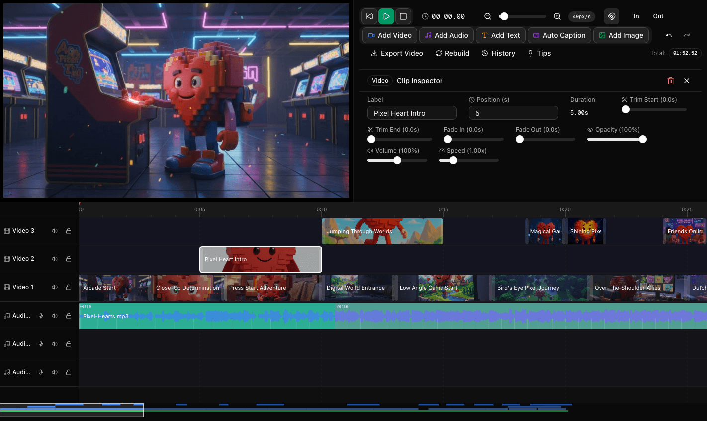
The problems are predictable, which means they are fixable
After you watch enough AI videos, the failures start to repeat. It is almost never the model’s fault in the way people assume. The same eleven mistakes account for the overwhelming majority of videos that feel cheap, confusing, or forgettable.
Every one of them has a concrete fix. Here they are, roughly in the order they cost you the most.
Mistake 1: Prompting the vibe instead of the shot
What it looks like: "A cinematic, beautiful, high quality shot of a city at night, 8K, award winning." The result is technically fine and completely generic.
Why it happens: Quality adjectives feel like they should help. They do not, because they do not describe anything the camera can actually do.
The fix: Replace adjectives with camera decisions. Shot size, angle, light direction, and movement. "Low angle medium shot, wet street at night, neon sign reflecting in a puddle, single figure walking toward camera, static." That gives the model a frame to build instead of a mood board to guess at.
Mistake 2: Accepting the first generation
What it looks like: One pass, minor tweaks, export. The video is usable but nothing about it stands out.
Why it happens: The first output is usually decent enough that it feels wasteful to try again.
The fix: Generate a second and third pass, put them on separate timeline tracks, and compare scene by scene. Almost always one pass has the better opening and a different one has the better ending. Build the final cut from the best of each rather than committing to a single version. This is the highest-leverage habit in the entire workflow, and it is the whole subject of The Secret to Perfect AI Videos.
Mistake 3: Character drift between scenes
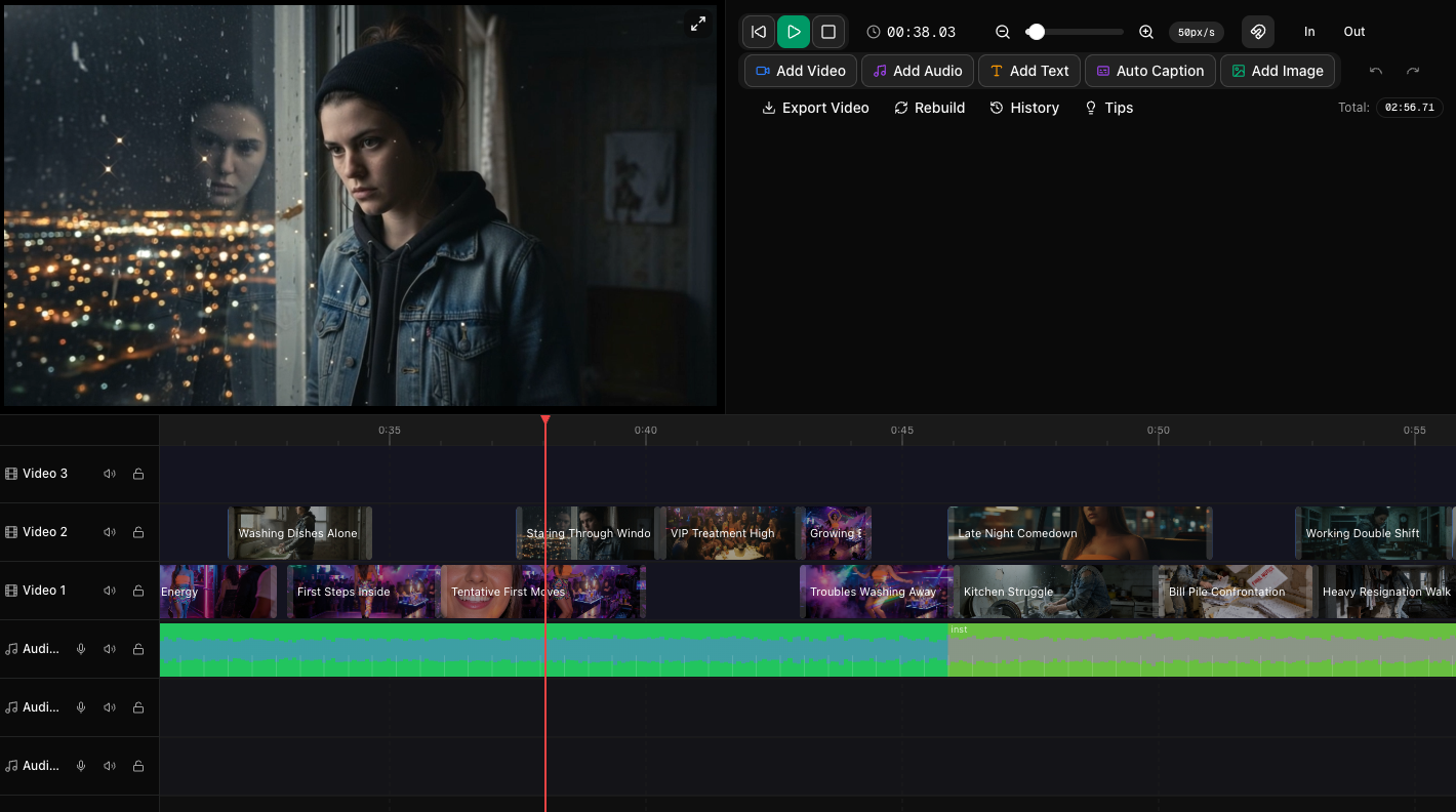
What it looks like: Your protagonist has a different face, different hair, or a different jacket in scene four than in scene one. Viewers may not consciously identify it, but the story stops feeling real.
Why it happens: Each generation interprets a text description of a person independently. "A woman in her thirties with dark hair" describes millions of different people.
The fix: Use a character reference image and carry it through every scene the character appears in. Describe wardrobe explicitly and repeat it verbatim. If a character has to change clothes mid-story, make that a deliberate story beat rather than an accident. There is a full walkthrough in Getting Great Characters in Trumbone.
Mistake 4: Every shot is the same size
What it looks like: Ten medium shots in a row. Nothing is wrong with any individual clip and the sequence is still boring.
Why it happens: When you do not specify shot size, models default to a comfortable middle distance almost every time.
The fix: Deliberately alternate. Wide to establish, medium to carry the action, close-up for emotion or detail. A cut from a wide to a close-up carries energy on its own. A cut from a medium to another medium carries nothing.
Mistake 5: No rhythm in the edit
What it looks like: Every clip runs the same length. The video feels like a slideshow with motion.
Why it happens: Generated clips arrive at uniform durations and it is easy to just lay them end to end.
The fix: Trim with intent. Hold wides longer, cut details short, and let clip length follow the energy of the scene. If there is music, align your cuts to the beat and let the section changes in the track drive your bigger transitions. An edit that moves with the music feels composed even when the individual shots are ordinary.
Mistake 6: No hook in the first two seconds
What it looks like: The video opens with a logo, a slow fade, or an establishing shot that explains nothing. On social, most of the audience is gone before the interesting part arrives.
Why it happens: Traditional film grammar builds slowly. Feed-based platforms do not give you that time.
The fix: Open on the most arresting frame you have. If the payoff is at second twelve, show a piece of it at second zero. Generate three alternate openings and compare them, because the first shot has more impact on performance than the rest of the video combined.
Mistake 7: Unreadable on-screen text
What it looks like: Small type, long sentences, thin fonts, or light gray text sitting on a busy background.
Why it happens: It looks fine on a large monitor while you are editing. It is being watched on a phone in bad light.
The fix: Big, short, high contrast. A few words per card, heavy weight, and enough contrast against whatever is behind it that it stays legible when the background changes. Keep it clear of the top and bottom of the frame where platform interface elements sit. If you cannot read it at arm’s length on your phone, it does not count as being on screen.
Mistake 8: Audio treated as an afterthought
What it looks like: Music at a level that buries the voiceover, or no sound design at all, or a track that fights the mood of the visuals.
Why it happens: Audio gets added last, usually when the visual work has already used up all the attention.
The fix: Pick the music before you finish the edit, because it determines your pacing. Keep the voice clearly above the music bed. Use a moment of near-silence before a reveal. If a video feels flat and the visuals are fine, the problem is almost always the audio.
Mistake 9: Wrong aspect ratio for the destination
What it looks like: A widescreen video cropped to vertical, with heads cut off and the subject sitting awkwardly off center.
Why it happens: The video was generated for one format and repurposed to another after the fact.
The fix: Decide the destination before you generate, and frame for it. Vertical needs centered subjects and headroom. Widescreen can use the edges of the frame. If you genuinely need both, generate a version for each rather than cropping one into the other.
Mistake 10: Transition overload
What it looks like: Whip pans, glitches, zooms, and flashes between every scene.
Why it happens: Transitions are the easiest thing to add and they feel like production value.
The fix: Default to a straight cut. Use a transition when it does a job, like signaling a jump in time or place. Two or three deliberate transitions in a video read as style. Fifteen read as a template.
Mistake 11: Generating without a decision process
What it looks like: Twenty versions of the same scene, no clear reason why any of them is better, and a token balance going down with nothing to show for it.
Why it happens: Regenerating is easy and evaluating is hard, so it is tempting to keep rolling instead of choosing.
The fix: Regenerate against a specific complaint. "The framing is too wide," "the lighting is flat," "the character does not match." If you cannot name what is wrong with the current version, another generation will not fix it. Create a small number of strong alternatives, review them with a clear question in mind, and commit.
A short triage list for a video that is not working
- Boring but technically fine? Shot sizes are all the same, or the edit has no rhythm.
- Looks cheap? The light has no direction, or the colors drift between scenes.
- Confusing? It is a script problem, not a footage problem. Regenerate the script before regenerating visuals.
- Feels fake? Character or environment continuity is breaking between shots.
- Nobody watches past the start? The opening two seconds are not earning attention.
- Flat despite good visuals? The audio is doing none of the work.
None of these require a better model
Every mistake on this list is a decision, not a limitation. Specific prompts, consistent references, varied shot sizes, deliberate pacing, readable text, and real attention to sound will do more for your output than any amount of regenerating in the hope that the next roll comes out better.
Fix the decisions and the same tools produce dramatically better videos.
To go deeper on the craft side, read How to Make AI Videos Look More Cinematic. For more workflow shortcuts, see 10 Tips and Tricks for Better Music Videos in Trumbone.