
Every Style Look in Trumbone, Shown on the Same Shot
Twenty-four style looks, one scene, one person, one brief. Fifteen colour grades, seven render media and two worlds, each rendered on the identical shot so you can see exactly what you are choosing.
The cheapest decision in an AI video
A style look is one choice that changes every frame after it. You are not grading twelve scenes by hand or rewriting prompts until the palette agrees with itself. You pick once, and the whole project inherits it.
The hard part has always been knowing what you are picking. A name and a colour swatch tell you almost nothing, so we rebuilt the picker around rendered examples and we are publishing all of them here.
How to read this page
Every image below came from the same brief, the same character and the same reference photo: she walks along a city street at dusk and turns to look toward camera, shop fronts and passing traffic behind her. One sample per look, no retouching, no cherry-picking. Anything that changes from one image to the next is the look doing its work.
The twenty-four fall into three kinds, and the kind matters more than the name.
Colour grades
Fifteen looks that keep the shot photoreal and change how it is lit. The people, the place and the action stay exactly as written. Only the mood moves. If you want your scene delivered as described, this is the group to shop in.
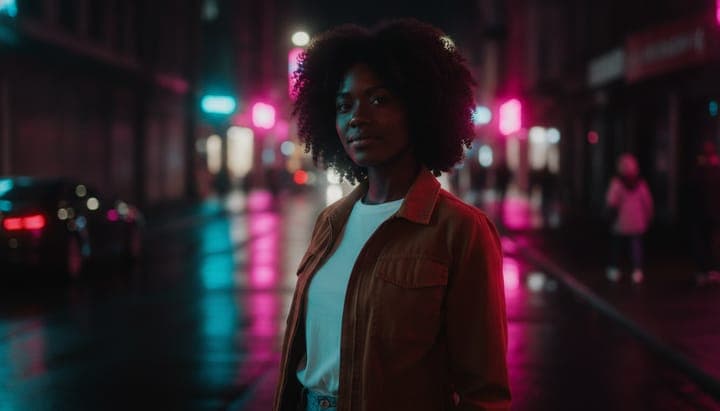
Neon Noir

Rain-slick streets and a city that only wakes up after dark. Magenta and cyan cut through the shadow, and everything else stays in it. Good for night exteriors, chase beats, and anything with a pulse.
Golden Hour Film

The last twenty minutes of daylight, stretched. Honey light, soft flare, and a warmth that makes everyone look like they are remembering something good. The safest flattering look in the set.
High Contrast Mono

No colour, no mercy. One hard key light, shadows with edges you could cut yourself on, and grain like silver. Use it when the story is about a face, not a place.
Pastel Dream

Lilac, mint and peach lit like a daydream. Overexposed, milky and soft enough to fall asleep in. Pairs well with slow songs and childhood.
Gritty Urban

Cold concrete under flat overcast light. Shot like nobody was trying to make it pretty, which is exactly why it reads as true.
Seventies Kodak

Faded orange and mustard with light bleeding around every highlight. Looks like it came out of a shoebox. The fastest way to place a scene in the past without changing a single prop.
Teal and Orange

The modern blockbuster grade. Cold shadows, warm faces, glossy and expensive. Reach for it when the scene needs to feel like it cost money.
Saturated Tropical

Turquoise, lime and hot coral under a hard midday sun. Every colour turned all the way up. Loud on purpose.
Low Key Candlelit

Mostly darkness, with small pools of warm light doing all the work. Intimate and slightly conspiratorial. Best on two people and a conversation.
Clean Commercial

Bright, airy and nowhere to hide. The light a product gets photographed in. The right choice for anything you are actually selling.
VHS Retro

Tracking bands, smeared colour and blown highlights. A tape rewound one time too many. It degrades the image on purpose, so use it where texture beats clarity.
Desert Heat

Sun-bleached ochre and pale sand, the sky washed to nothing, air shimmering off the ground. Heat you can see.
Cold Winter

Everything drained to blue-grey and white. Flat light, cold haze, and breath you can see. The opposite end of the same axis as Golden Hour.
Underwater

Deep teal with god rays coming from somewhere above and particles drifting past the lens. It works on dry scenes too, which is half the fun.
Natural Documentary

Barely a grade at all. Honest daylight and honest skin, like someone simply happened to be filming. The look to pick when you want the performance to carry the shot.
Render media
Seven looks that change what the scene is made of. Nothing in frame stays photographic: the characters are drawn, sculpted, knitted or painted along with everything around them. These transform far harder than a grade, so read them as a different product rather than a stronger filter.
One thing worth knowing before you pick one. A render medium re-draws your character, so a photographic reference face becomes an illustrated version of that face. That is the intended behaviour, and it is what stops you ending up with a real person standing inside a cartoon.
Anime Cel

Hand-painted animation. Inked outlines, flat cel shadows and luminous skies. Every character is drawn, never photographed.
Comic Ink

Heavy brush linework, halftone dots and flat spot colour on newsprint. A panel, not a frame.
Animated 3D

The family-film look. Big expressive eyes, soft geometry and warm cinematic light on a stylised world.
Claymation

Plasticine puppets with the thumbprints still in them, lit like a miniature set. Charmingly handmade, and the most distinctive look in the set.
Storybook

Gouache and coloured pencil on paper you can see the tooth of. Gentle, muted and hand-drawn.
Made of Yarn

A world crocheted out of wool, where everyone is a stuffed doll with stitched seams and an embroidered face.
Oil Painted

Loaded brush strokes, impasto ridges and canvas weave showing through. Painterly edges instead of focus.
Worlds
Two looks that are neither a grade nor a material. A world sets the production design of everything in shot, so the costumes, props, signage and light sources all belong somewhere else, whatever your scene happens to describe.
Steampunk

Brass, rivets and pressure gauges. Victorian tailoring, gaslight glow and steam drifting through every shot.
Futuristic

The same place and the same moment, advanced a hundred years. New architecture, new vehicles, new light.
How to choose
Start from the medium, not the colour. The first question is whether your video is photoreal or not. Get that wrong and no amount of palette adjustment will save it. Get it right and any grade in the list will work.
Match the look to the length of the piece. Loud looks like Saturated Tropical, VHS Retro and Neon Noir are excellent for thirty seconds and exhausting for four minutes. Natural Documentary and Golden Hour Film hold up across a full song.
Do not fight your own reference photos. If your character reference was shot in flat daylight, Low Key Candlelit has to invent a great deal. It will do it, but you will get more consistency from a look that sits closer to where the reference started.
Pick before you generate, not after. A look applies at generation time, so choosing it once at the start costs nothing, and switching it later means regenerating scenes you already paid for.
Try one
All twenty-four are live in the style picker on every project. Open a project, open the style panel, and the thumbnails you see are rendered examples now rather than colour chips.
Start a project and pick a look.